Note: This is a republication of a full write-up of the machine learning research to understand and improve systematic value strategy, which was originally shared in my 2019 Q4 letter [Link]
I’m also start trying Medium. It is published on Medium too. [Link]
This article is a collection of thoughts and experiments of my personal endeavor from a quantitative perspective to understand why “Value” as an investing style didn’t perform compared to other styles for an extended long period of time. It consists of mainly two parts: 1) review of others’ relevant researches & 2) an experiment of using Clustering to explore reasons for such phenomenon and potential ways to improve systematic value strategies.
“Value” means differently for different investors. It is important to note that “Value” in context of this write-up mainly refers to the “value” factor, e.g. Fama-French HML factor or variations of it. In other words, it is a systematic long-short strategy longing a group of the cheapest stocks and shorting a group of the most expensive stocks.
My main hypothesis is that GAAP/IFRS currently does not do a as well job in representing fairly companies’ value as historically. Thus “Value” may not work on broad stock universe yet may still work in certain types of stocks. To classify stocks into such “types”, I tried to use Clustering, an unsupervised machine learning technique, to test if it works.
You can also download the pdf here: [Link]
Review of Relevant Researches
Both the market and the academia struggled to rationalize why “value” suffered for such a long period of time. It worth noting one recent working paper by NYU & University of Calgary professors initially named “Explain the Demise of the Value Investing” [Link].
This research argues that the reasons for value not working are because of “(1) accounting deficiencies causing systematic misidentification of value…, and (2) fundamental economic developments which slowed down significantly the reshuffling of value and glamour stocks…”
Point 1 has its merit and I believe is well perceived by discretionary investors. For example, as new businesses today increasingly run on intangible assets (brands, software, digital content & processes, etc.) than tangible ones (plants, factories & equipment, etc.), the investment to build these intangible assets are usually intangible as well (thus hard to measure). For example, a typical software company would use heavy Sales & Marketing budgets to acquire new customers who usually can remain as customer for 5–10 years. This so called customer acquisition cost (CAC) however is fully expensed (in SG&A) on the first year through income statement, which should really be amortized in a schedule matches expected customer retention period (similar to how an equipment investment is depreciated in a schedule according to expected useful life). This means these intangible investments never reach the balance sheet (i.e. never reflected on book value), thus creating a distortion when categorizing stock style simply using book to market ratio.
For this reason, academia has been working on “upgrading” our modern accounting standards. Some notable works I have encountered include:
- Consumer surplus-based value of digital economy [Link] by MIT professor Erik Brynjolfsson
- Customer based valuation & accounting disclosure [Link] by UPenn professor Peter Fader & Emory professor Daniel McCarthy
There are other phenomenon that current accounting standards do not measure well, e.g. low or even negative book equity value due to ever more popular corporate buybacks. On this topic, O’Shaughnessy Asset Management had done a quality study (dated April 2018) on exploring a few more factors contributing the book value distortion (conservatism in depreciation, buybacks & dividends etc.) [Link]
Point 2 argues that it now takes longer for value/growth trend to mean reverting. To measure this “slowdown” in reversion, the authors used a few ways: rank correlation, length of staying in the specific bucket & large stock price upticks and downticks, all of which show supporting evidences. On explaining the “why”, the authors pointed to shrinkage in bank lending (for value companies) and structural advantages (e.g. scalability, network effects, etc.) of growth companies (who are mostly software, pharmaceuticals & electronics businesses).
I agree with the authors’ measurements of the mean-reverting slowdown (i.e. the “what”), however was not fully convinced by their assessment of the “why”. I felt the market structure itself (i.e. how Mr. Market price stocks) would be one of the crucial factors for such regime shift.
Most of asset pricing theories as we know them (CAPM, Fama-French etc.), are developed during a period from the great Depression to 80s & 90s. The period witnessed a secular institutionalization of active asset management from a news, technical price signal & retail investor driven market, to a business value driven investing style (be it “value” like Warren Buffett or “growth” like Philip Fisher). Thus, it is possible that the patterns factor investing learned over multiple decades (e.g. value outperforms growth & small cap outperforms large cap) are from a Mr. Market consists of mainly business value driven investors. Yet since the birth & growth of passive & quantitative investing, the market has been secularly reverting to a “non-business-value-driven” style. In essence, quant/factor investing is not too different than news & technical approach in the early 20s, they all try to predict how security prices react to information (be it news, historical price pattern, financial reporting or earning announcements, etc.) regardless of the underlying business value.
I believe this secular reversal would have strong implication on how market behaves. I think this COVID-19 pandemic induced volatile market (from 3/9/2020 to 3/18/2020) was also a manifestation of such shift, all major US indices experienced over +-5% movement on all 8 days, and on last Thursday & Friday Dow Jones Industrial Average had a back to back 9% swing. When did the market saw the last 9% back to back swing? We had to go all the way back to 1929.
To sum up, I believe both 1) more accounting deficiencies in measuring business value & 2) an increasingly non-business-value driven Mr. Market, play important roles in shaping the current investing landscape. Thus, to outperform Mr. Market in future, existing strategies need to take consideration of such shifts and evolve around them.
To Embark the Journey of Stock Clustering
In this exploration, I tried to use an unsupervised machine learning method call K-Means Clustering [Link] to perform an alternative way of stock classification. The intuition is that we know value factor have failed to work on a broad stock universe. But could there be better way of classifying stock so that we can see maybe value still works in certain types of stocks (say where GAAP/FASB standards still do well in measuring business) while not so in others? The advantage of such machine learning technique (compared to manual classification like GICS Sector) is that I don’t have to tell the algorithm about how to do so, all I need is to define metrics (also called “features” in Machine Learning term) for it to use, and the algorithm will try to find patterns by itself to group similar stocks into “clusters” (think it as “type” of stocks).
 I started from Joel Greenblatt’s famous “Magic Formula”, which looks at stocks from two dimensions: valuation & profitability. For valuation, I decided to look at EV/EBITDA, and for profitability I chose to use Free Cash Flow Return on Invested Capital (FCFROI). The main reason is to measure cash flow profit, as opposed to accounting profit, albeit neither EBITDA nor FCF is perfect. One important note to remember for interpreting my charts throughout is that all factors are ranked by percentile and the direction is always from favorable (0) to adverse (1). For example, for EV/EBITDA factor, 0 is the cheapest stock, 1 is the most expensive stock, and for FCFROI, 0 is the most profitable, 1 the least profitable. Next, we decided we will conduct this research mainly focus on US Large Cap space (equivalent of Russell 1000).
On the left we picked a single day snapshot (1/31/2019) as an example and demonstrated the scatter plot of these two metrics (top left), then the 2, 4 & 8 groups clustering. There are some interesting observations:
- The 2 groups clustering shows that EV/EBITDA is a primary axis in classifying stocks, as the boundary line rely more on valuation than on profitability.
- The 4 groups clustering shows a more “traditional” quadrant framework, and the bottom left is basically the “value corner” which had stocks having cheapest valuation and highest profitability.
- The 8 groups clustering also shows a quite structured classification, where both dimensions are cut up in 3 sections (low, median and high).
A Time Story of the 2 Groups Clustering
Based on what we observed from the 2 groups clustering on 1/31/2019, the valuation seems to be more influential factor. I wanted to see whether that observation held true over time. To the right is what I saw for data points at the end of January of each year from 2009 to 2020. Although it varies year over year, valuation still drives this two groups clustering. There are however some years profitability matters more (e.g. 2018 & 2019 where the slope of the boundary line flattening) and some years profitability matters less (e.g. 2009 & 2016, where the slope of the boundary line was very steep).

Anecdotally, we happened to see value as a factor performed the best in 2009 & 2016 yet squandered in 2018 & 2019. So, there may be some interesting implication of forward return for each cluster.
Let’s Talk About Money, I Mean, Returns

A natural extension from above observation is to look at forward performance of each cluster and see whether there is difference. For this practice, I will use the 8 groups clustering as of 1/31/2019 as an example, for the purpose of trying to capture nuances of smaller groups, as seen the left part of chart on the left. On the left you see the same scatter plot, with color scale representing forward year return percentile ranks (green means better return & red mean worse). You can probably see with naked eyes there is some pattern (i.e. greener towards bottom right, and redder towards left).
Below is the distribution of absolute return (left) & return rank (right) for forward looking 1 month, 3 month & 1 year from 1/31/2019 by cluster. A reminder of ranking direction is from favorable (0) to adverse (1), thus return ranks 0 means the best return among all stock, and 1 means the worst.

- By multiple measures, Cluster 1 (bottom right from the scatter plot, or the most expensive but the most profitable stocks) turned out to be the best performing cluster for 2019.
- Cluster 4 & Cluster 5 are the rest two obvious outperformers after Cluster 1, on all three-holding period forward returns. All three of them form the right bottom corner (moderate to expensive & moderate to very profitable stocks).

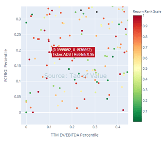
- Cluster 2 (top right corner, or the most expensive yet the least profitable stocks) had mixed forward performance. On 1-month forward return, its median is among the worst, yet on 1 year forward return basis, its median came in the 4th best. It’s also notable that Cluster 2 had very wide distribution, as some of those most topical names are in this cluster. For example, as seen below, both the top performing (ranked 0) Shopify (Ticker: SHOP) and worst performing (ranked 1) Tilray (Ticker: TLRY) are from this corner (see below left zoomed-in chart). It becomes obvious that accounting, even after adjusting for cash-based profit, still does a lousy job in describing businesses in this cluster.
- Cluster 6 (i.e. the Magic Formula corner, or the cheapest & the most profitable stocks) tends to do worse towards longer holding period. From above right zoomed-in chart, we also see much more red dots than green ones, indicating more challenging environment for the “Magic Formula” during 2019.
How Did “Value” Do in Each Cluster?
We know that “Value” didn’t work well on a broad stock universe, what if we try to do “Value” in each cluster? That means instead of buying the cheapest 10% & shorting the richest 10% among all stocks, we do so in each cluster. Theoretically, if Clustering does its job and groups stocks by its own type, we should be able to avoid some of these accounting distortions. Or thinking anecdotally, among Cluster 2 (top right corner, which a cross-sectional Value factor may end up shorting entirely), we may be able identify SHOP as a buy and TLRY as a short!
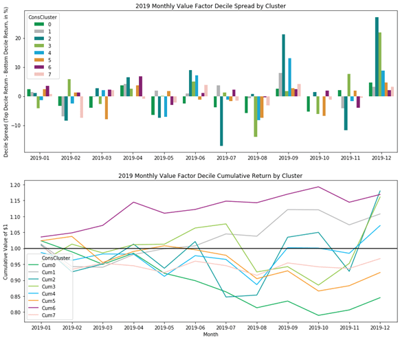
Below monthly performance summary showed some fascinating findings:
- Among 8 clusters, 5 of them returned positively over 2019, this is very different picture compared to the overall lackluster Value factor performance over the same period. One thing to note is that we are looking at US Large Cap Value, which as a group did better than Mid & Small caps.
- Cluster 6 (the “Magic Formula” corner) worked very well over 2019, totally 17% return! Also, even when it was down on 3 out of 12 months, the downside was limited.
- Cluster 2 & Cluster 3 (top right & left sections, or the least profitable + both cheap & expensive ones) returned similarly at 18% & 16% respectively, however with much more volatility. The performance was also heavily driven by two single months (Sep & Dec).
- Cluster 0 (the middle left section, or cheap and moderately profitable stocks) is the worst performing cluster for “Value”, yielding -15%. This section may be where investors encounters the most “value traps” (moderate profitable on cash basis, and optically cheap).
- Cluster 5 (the middle bottom section, or highly profitable and moderately valued stocks) was the second worst cluster for Value. Anecdotally, this section is the home for some of these “wide moat” names, e.g. Apple (AAPL), Microsoft (MSFT), Transdigm (TDG) & Moody’s (MCO). In any case, this cluster may seem like a bad place to apply deep “value” factor like P/B ratio, as shorting any of these names wouldn’t make sense.
- Bottom line is that we do see clusters demonstrate unique profiles which some of them help “Value”, while some hurt it.
Further Implication
In above analysis, although the algorithm uses ex-ante information only (i.e. TTM EV/EBITDA & TTM FCFROI) to perform clustering at each month end, I did “peek into the future” for the forward return. Thus, it is not immediately actionable until I build a predictive model to forecast whether “value” may or may not work for each cluster in future.
However, what was fully actionable is that I didn’t need to predict winning/losing cluster, rather I can simply do “Value” with a cluster neutral technique, that is to long the cheapest 10% stocks & short the richest 10% stocks within each cluster. Below is the cumulative return chart of three monthly rebalanced long-short value strategy (cross-sectional, sector neutral & cluster neutral). The cluster neutral shows promise as not only it improved the return the most, but also with the least volatility (14%, compared to Cross-sectional’s 19% & Sector Neutral’s 15%). Looking forward, with better intuition in understanding why certain clusters don’t work for Value, there are potential further improvements we can test (e.g. introduce more features & avoid the “wide moat” cluster altogether). One last thing to note is obviously that one year is a short period time, and it requires a longer time period of history to validate it further.

